Creating and styling a dynamic form with Storyblok, Next.js, and Tailwind CSS
Storyblok is the first headless CMS that works for developers & marketers alike.
In this article, you will learn how to create and style a dynamic form using Storyblok (opens in a new window) and Next.js (opens in a new window). We will also include Tailwind CSS (opens in a new window), a utility first CSS framework. By using these technologies, you can create a dynamic form that is both functional and visually appealing.
The main objectives of this article are to show you how to:
- Integrate Storyblok with Next.js
- Create a dynamic form component using Next.js and Storyblok
- Fetch form fields from Storyblok and render them in the form component
- Style the form using Tailwind CSS
Prerequisites
This article assumes that its readers have the following:
- Experience using Storyblok or any Headless CMS
- Experience with using Next.js. If you are a beginner to this technology, you can read my article about the framework here (opens in a new window).
- Basic CSS experience.
- Node.js and Node Package Manager (NPM) installed.
Getting Started
In this section, we will set up Next.js, install all the dependencies needed for the tutorial, and initialize Storyblok into our project.
Setting up Next.js
Create a new Next.js project with:
npx create-next-app@latest
Installing dependencies
First, install Storyblok’s React SDK into your Next.js project:
npm install @storyblok/react
Next, install Tailwind CSS, its form plugin, PostCSS, and Autoprefixer to ensure that your CSS styles are properly processed and optimized for modern browsers:
npm install -D tailwindcss @tailwindcss/forms postcss autoprefixer
Lastly, install react-hook-form, which will help validate all inputs given to the form:
npm install react-hook-form
Initializing Storyblok
In Next.js custom App, paste the following code:
import { storyblokInit, apiPlugin } from "@storyblok/react";
const components = {};
storyblokInit({
  accessToken: "PASTE YOUR STORYBLOK ACCESS TOKEN HERE",
  use: [apiPlugin],
  components,
});
export default function App({ Component, pageProps }) {
  return <Component {...pageProps} />
}
For now, our components are empty. We will parse the form components for initialization later when it gets created.
Creating the form component
In this section, we will create a reusable block component for form inputs which we will use later to create our dynamic form.
The block will contain the following fields: Name, Label, Placeholder, Type, and Validators. All fields will be of type Text except for the “Type” and “Validators” fields of the Type Single-Option and Blocks, respectively.
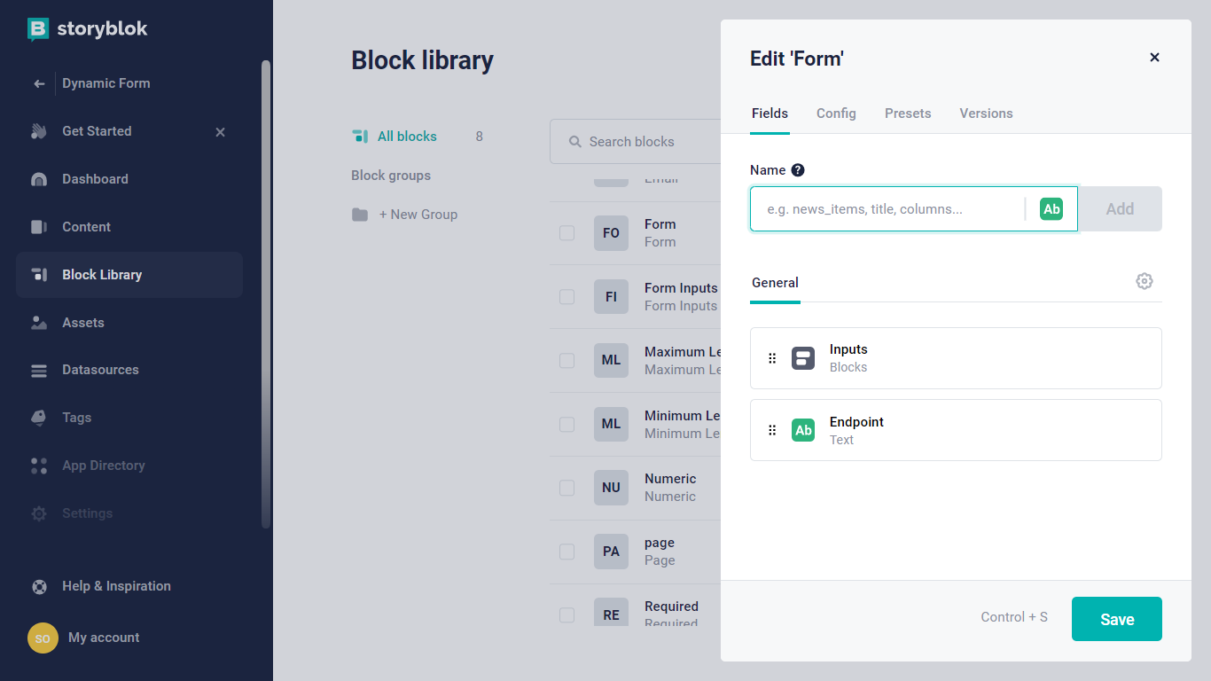
Go to the Block Library {1} section of your Storyblock space and add a new block. Give the block a technical name of “Form Inputs,” {2} and a type of nestable block {3}, as shown below
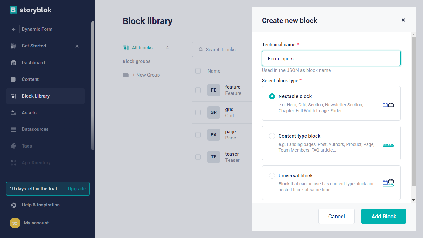
Storyblok form blocks
Now, define the fields that will be inside the Form Inputs block. These fields should be the: Name, Label, Placeholder, Type, and Validators, which we mentioned earlier.
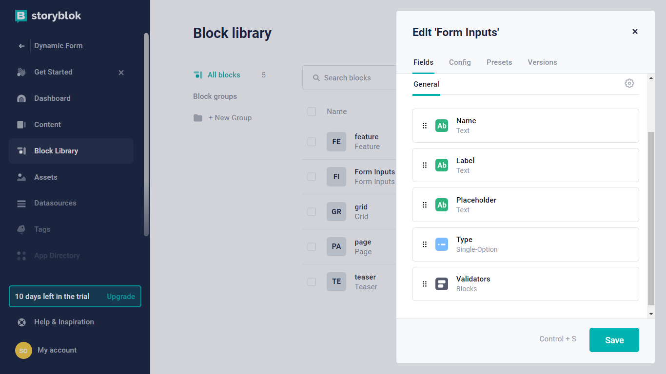
Form fields
Save. Now click on the Type field to edit. Next, scroll to the bottom and add some options {1}.
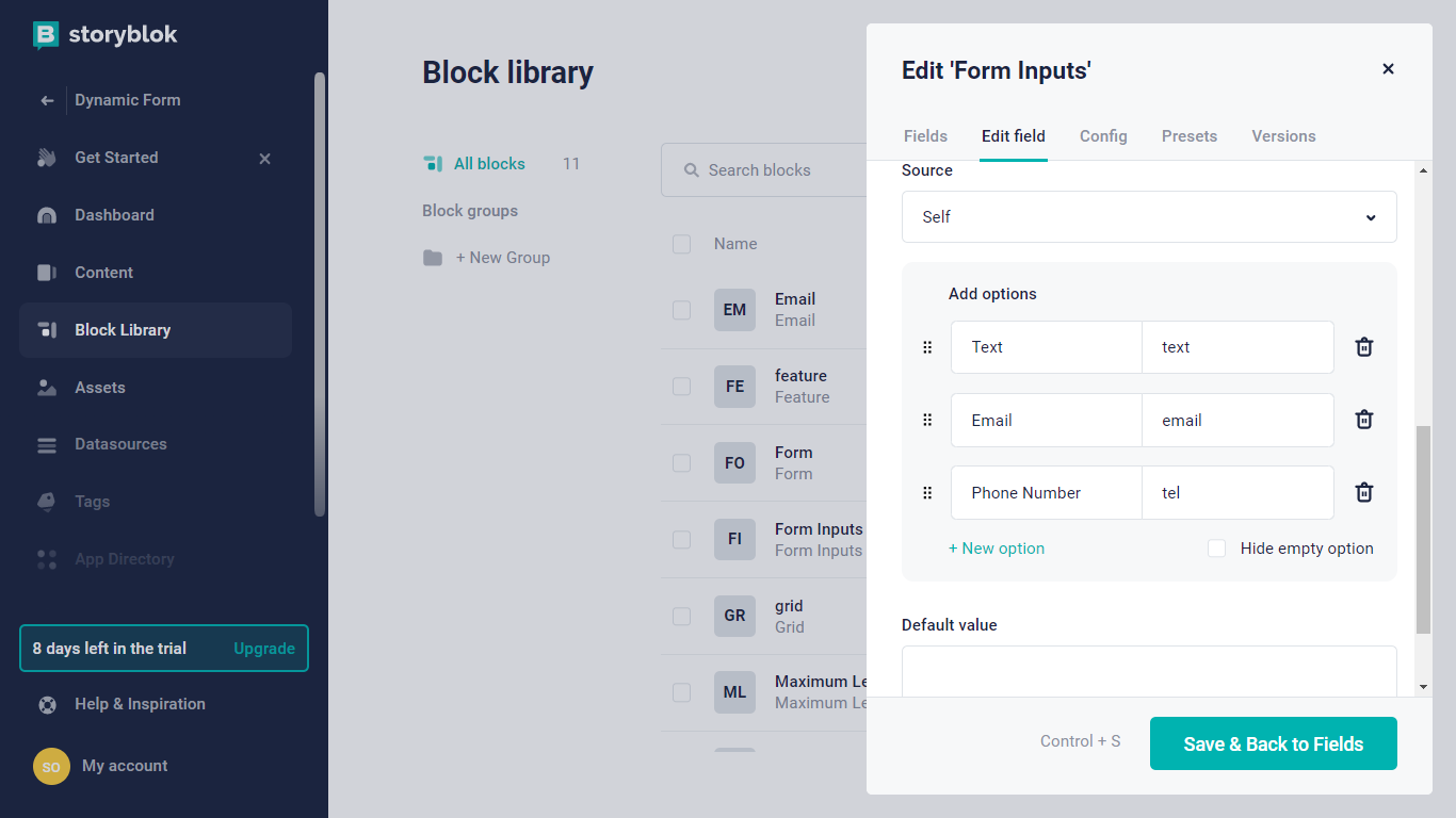
Editing the form input fields
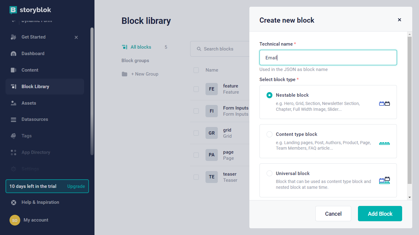
Save. Now, we need to add some validators to our Validators block. We’ll add 5 validators: Email, Minimum Length, Maximum Length, Numeric, and Required. These validators are blocks, so we must create them first. Close the Form Input window and create these new 5 blocks.
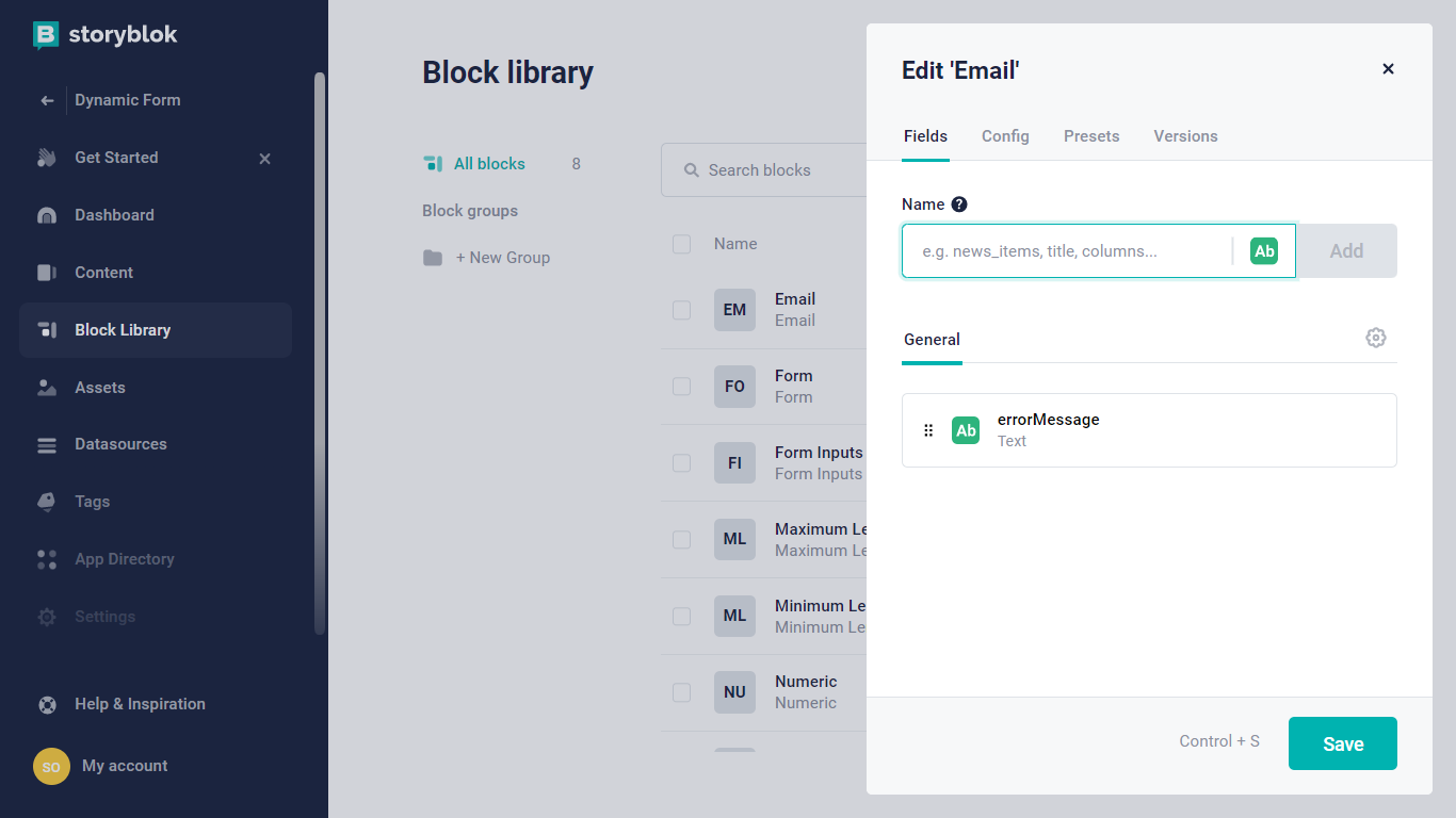
Create the first block, Email:
Email block component
Define its fields. Email should have a single field of type Text for error messages. Input “errorMessage” and save:
Editing email fields
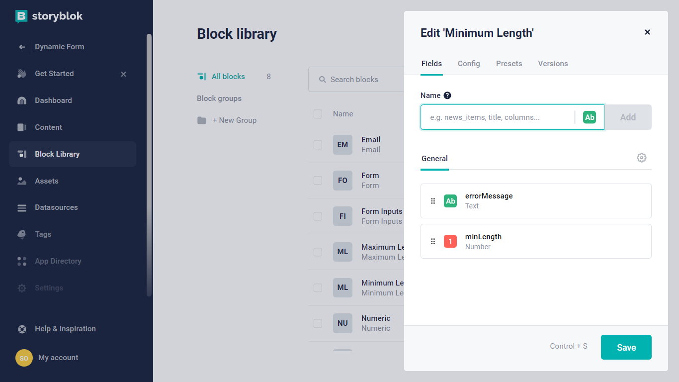
Close the window and create the next block, Minimum Length. This block should have two fields (“errorMessage” with type Text and “minLength” with type Number):
Edit minimum length field
Save and do the same for the Maximum Length block (“errorMessage” with type Text and “maxLength” with the type Number), Numeric block (“errorMessage” with type Text), and Required block (“errorMessage” with type Text).
Create a new group in the block library called Validators {1} and move all the validators to that group folder:
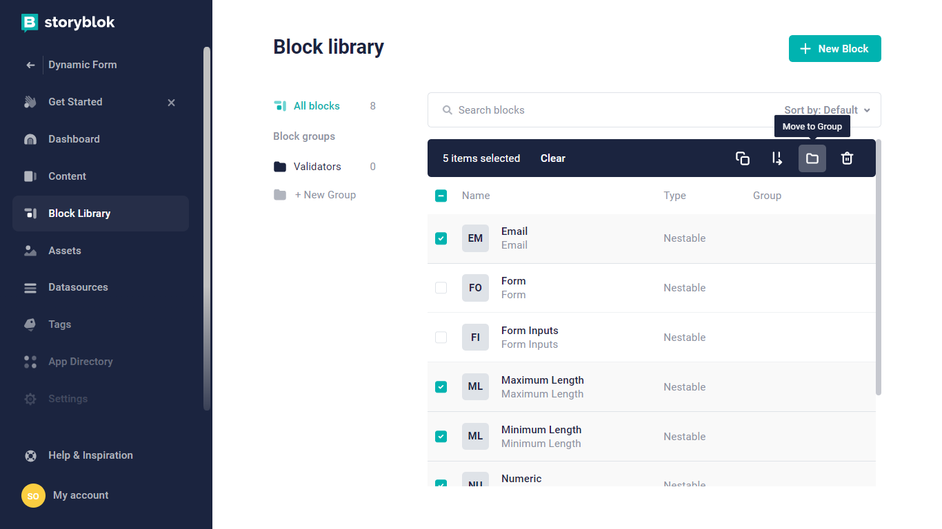
validators group in the block library
Now, go back to the Form Inputs block and click on Validators to whitelist the new group we created. Next, scroll to the bottom and click the “Allow only specific components to be inserted“ checkbox. Lastly, click on the “Group(s)” dropdown and add the “Validators” group.
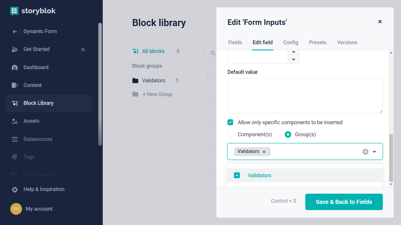
Editing Form Inputs block
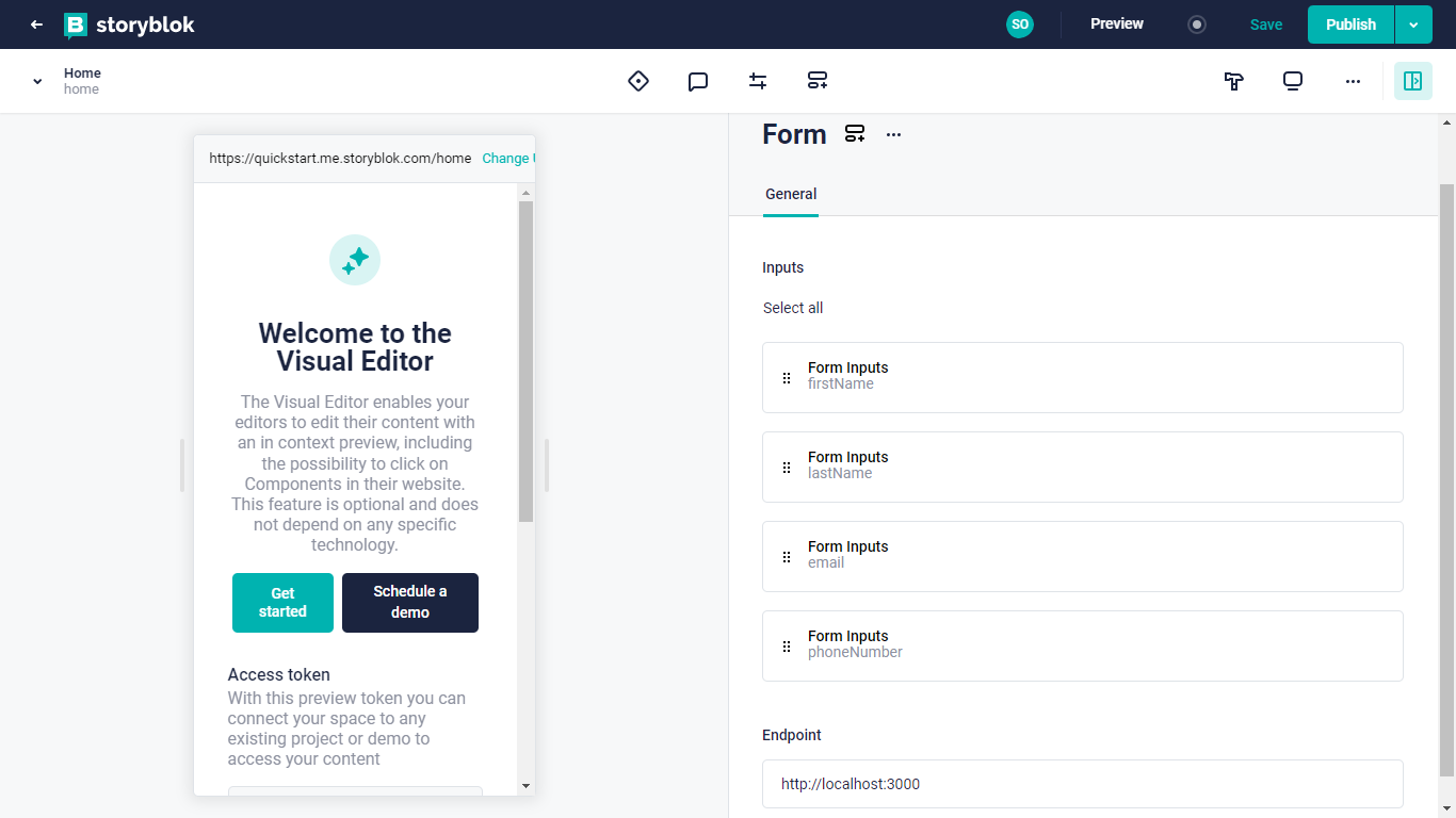
Awesome! Now let’s create our dynamic form. While in the Block Library section of Storyblok, let’s create the form block from here. Create a new block called “Form” with two fields. Name the first “Inputs” of type Blocks and name the second “Endpoint” of type Text. Inputs will contain our custom form fields, and Endpoint will contain the URL that receives the form data. Whitelist only Form Inputs in the Inputs block and save.
Form component block
Navigate to the Home story of the ‘Content’ section in Storyblok. First, delete the Teaser and Grid boilerplates in the story. Then, add Form to the Body block.
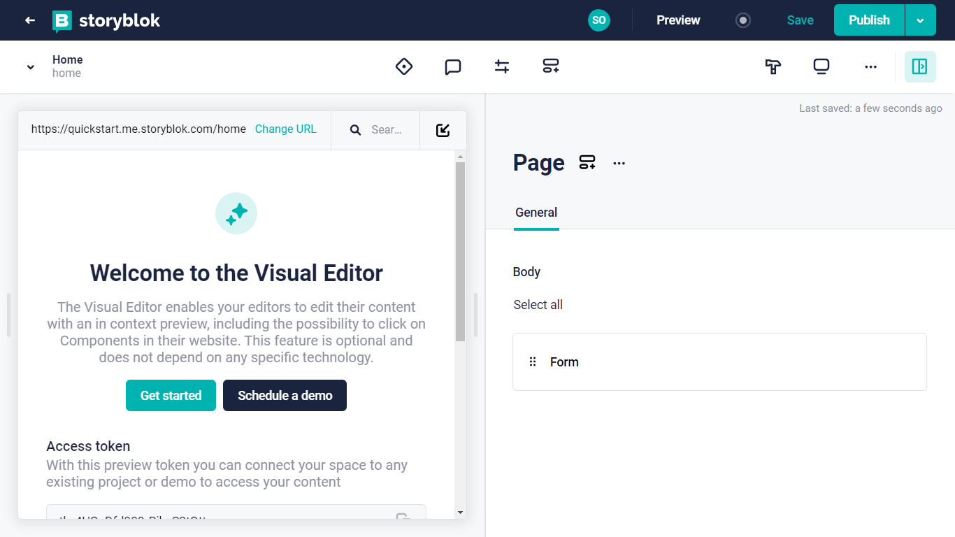
page component in visual editor
Now click on Form and add some blocks to Inputs. Remember that we whitelisted Form Inputs as the only component type to be used inside Inputs.
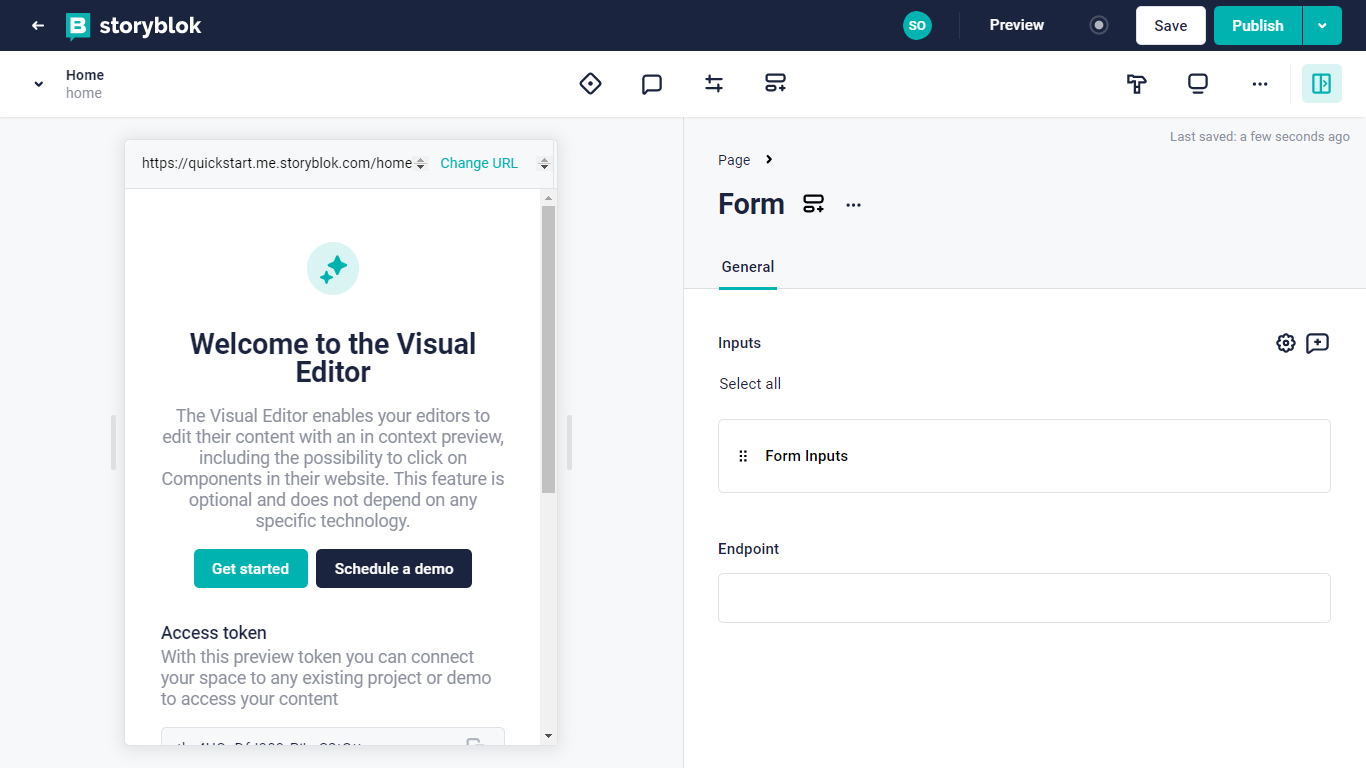
Form input component
Click on Form Inputs and define the first input for the dynamic form.
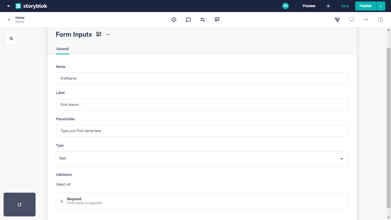
Defining form inputs
In this example, the first name is the input for the first field, and the only validator added is Required. Click on the Required validator and input an error message.
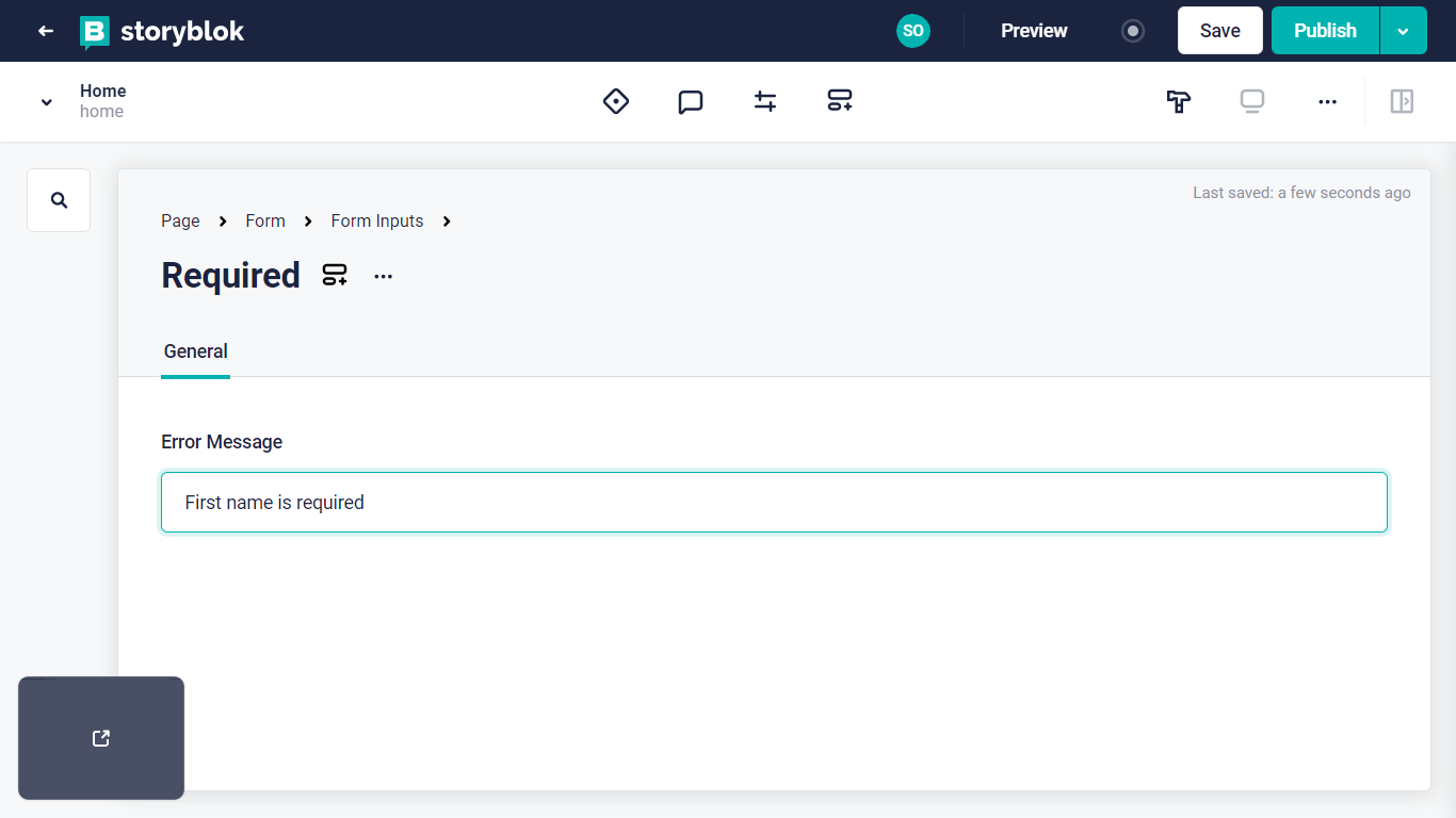
required form input
Click on the ‘Save’ button at the top and add another validator block for the last name. Add only the Required validator as well.
We now have 2 form input fields (first and last names). Let’s add two more for email and phone numbers. The content of the email will have a total of 2 validators (Email and Required).
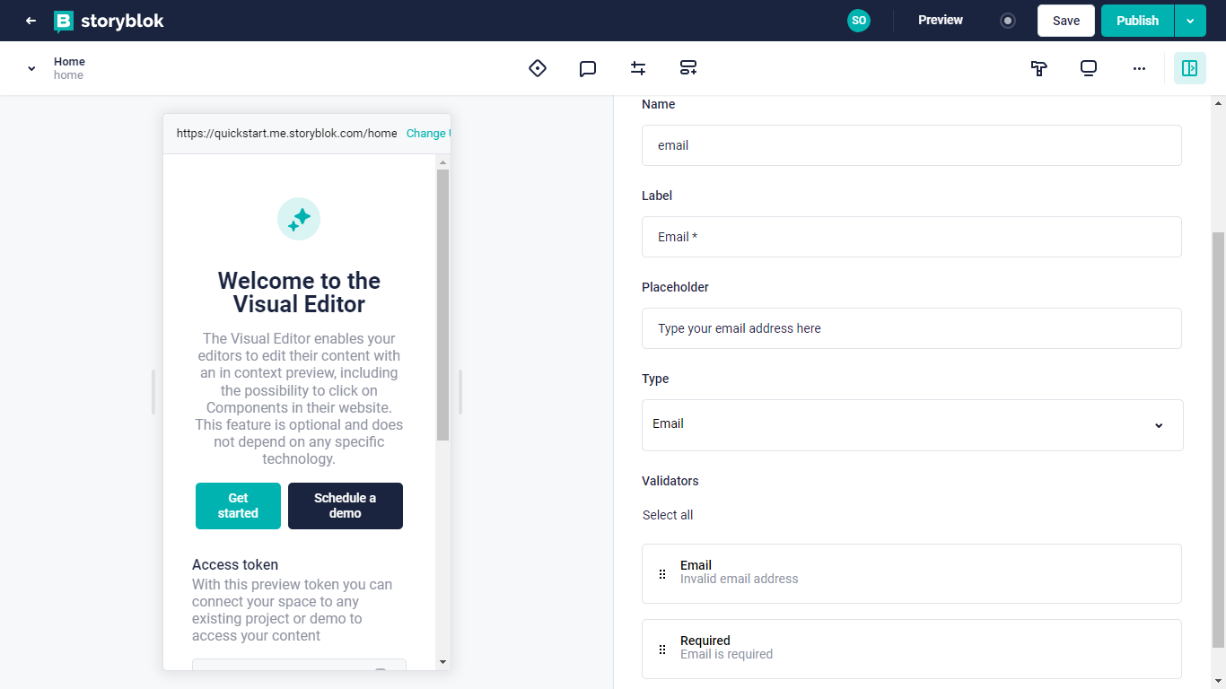
Form component on the visual editor
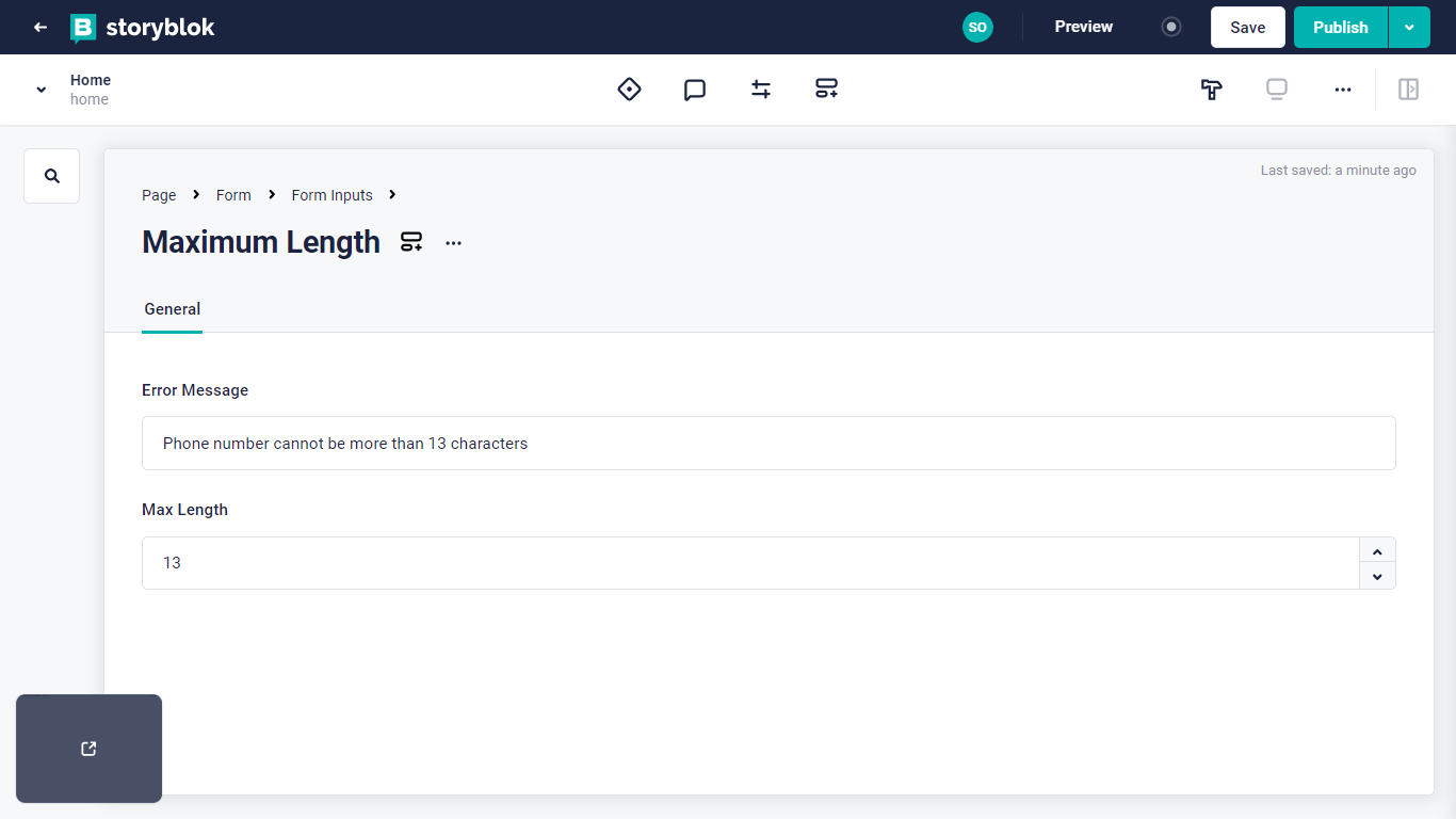
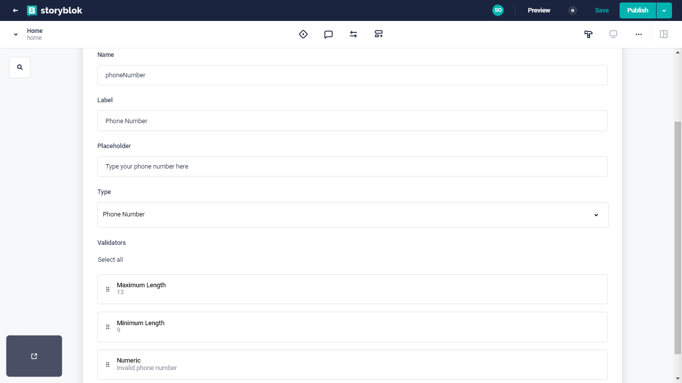
The content of the phone number will have a total of 3 validators (Maximum Length, Minimum Length, and Numeric). This is what the error message for the first validator looks like:
Validators component in the visual editor
Fill in the content with Minimum Length and Numeric validators:
Form component with fields
Finally, go back to Form and add a URL to Endpoint. This endpoint will be used when submitting the form on the front end.
Dynamic form component
That’s it! Save the changes. In the next section, we will learn how to fetch the form to Next.js.
Fetching the form fields
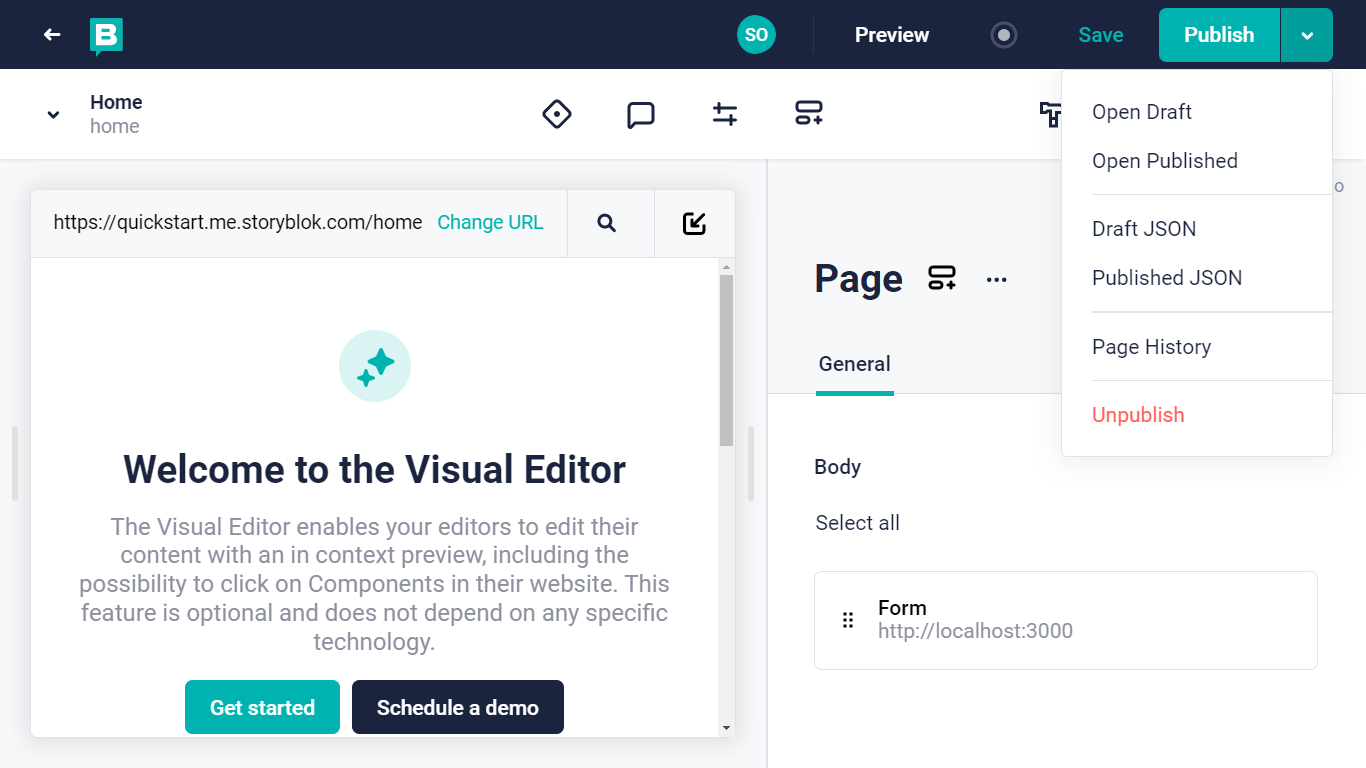
This section will fetch our dynamic form from Storyblok to our front-end application. Before we start, take a second to look at the Draft JSON {1} of our entire content. You can find this in the dropdown by the side of the Publish {2} button. This will give you an idea of how all Storyblok components are structured.
Draft and published JSON in Storyblok
Return to your Next.js project and create a “components” folder to hold your Storyblok components. Because all the blocks we created are nestable, we can create components for each from the top level (Page) to the last (Validators). The first component we’ll create is for the page. Create a “Page.js” file and paste the following code to map through all the components in its body (Body block).
import { storyblokEditable, StoryblokComponent } from "@storyblok/react";
export default function Page({ blok }) {
  return (
    <main {...storyblokEditable(blok)}>
      {blok.body.map((nestedBlok) => (
        <StoryblokComponent blok={nestedBlok} key={nestedBlok._uid} />
      ))}
    </main>
  );
}
Next, we’ll create another file, “Form.js”, for our Form component. We’ll use the useForm hook from “react-hook-form” to validate the form’s inputs and will log all inputted data and the form’s endpoint to our browser console. The next level is the Form Inputs block we will map through and feed with the register and error functions from useForm.
import { storyblokEditable, StoryblokComponent } from "@storyblok/react";
import { useForm } from "react-hook-form";
export default function Form({ blok }) {
  const {
    register,
    formState: { errors },
    handleSubmit,
  } = useForm();

  function submitForm(data) {
    console.log(data, blok.Endpoint);
  }
  return (
    <form {...storyblokEditable(blok)} onSubmit={handleSubmit(submitForm)}>
      {blok.Inputs.map((nestedBlok) => (
        <StoryblokComponent
          blok={nestedBlok}
          key={nestedBlok._uid}
          register={register}
          errors={errors}
        />
      ))}
      <input type="submit" />
    </form>
  );
}
Create another file, “FormInputs.js,” for our Form Inputs component. We will use the register function, fed to the component to register each input field and feed the name of the input field and any errors to the next level, the Validators blocks.
import { storyblokEditable, StoryblokComponent } from "@storyblok/react";
export default function FormInputs({ blok, register, errors }) {
  return (
    <div {...storyblokEditable(blok)}>
      <label>{blok.Label}</label>
      <input
        type={blok.Type}
        placeholder={blok.Placeholder}
        {...register(blok.Name, {
          required: blok.Type === "tel" ? false : true,
          pattern:
            (blok.Type === "email" &&
              /^[a-z0-9,_%+-]+@[a-z0-9,-]+\.[a-z{2,4}$]/) ||
            (blok.Type === "tel" &&
              /^[\+]?[(]?[0-9]{3}[)]?[-\s\.]?[0-9]{3}[-\s\.]?[0-9]{3,8}$/),
          maxLength: blok.Type === "tel" && blok.Validators.find((findMax) => findMax.maxLength).maxLength,
          minLength: blok.Type === "tel" && blok.Validators.find((findMin) => findMin.minLength).minLength,
        })}
      />
      {blok.Validators.map((nestedBlok) => (
        <StoryblokComponent
          blok={nestedBlok}
          key={nestedBlok._uid}
          errors={errors}
          inputName={blok.Name}
        />
      ))}
    </div>
  );
}
We have 5 validators (Email, Required, Maximum Length, Minimum Length, and Numeric). So let’s create a new folder inside the components folder for them. Name the subfolder “validators.”
Create an Email.js file in the subfolder for the first validator. Before displaying the error message, we’ll check to see if the error is registered under the email and is of the “pattern” type:
import { storyblokEditable } from "@storyblok/react";
export default function Email({ blok, errors }) {
  return (
    <div {...storyblokEditable(blok)}>
      {errors.email?.type === "pattern" && blok.errorMessage}
    </div>
  )
}
Next is the Required validator. Create a Required.js file with the code below. We’ll check to see if the registered error and the input name are the same before displaying the error:
import { storyblokEditable } from "@storyblok/react";
export default function Required({ blok, errors, inputName }) {
  return (
    <div {...storyblokEditable(blok)}>
      {
        errors.firstName?.type === "required" &&
        inputName === "firstName" &&
        blok.errorMessage
      }
      {
        errors.lastName?.type === "required" &&
        inputName === "lastName" &&
        blok.errorMessage
      }
      {
        errors.email?.type === "required" &&
        inputName === "email" &&
        blok.errorMessage
      }
    </div>
  );
}
Next is the Maximum Length validator:
import { storyblokEditable } from "@storyblok/react";
export default function MaxLength({ blok, errors }) {
  return (
    <div {...storyblokEditable(blok)}>
      {errors.phoneNumber?.type === "maxLength" && blok.errorMessage}
    </div>
  );
}
Then, the Minimum Length validator:
import { storyblokEditable } from "@storyblok/react";
export default function MinLength({ blok, errors }) {
  return (
    <div {...storyblokEditable(blok)}>
      {errors.phoneNumber?.type === "minLength" && blok.errorMessage}
    </div>
  );
}
Finally, the Numeric validator:
import { storyblokEditable } from "@storyblok/react";
export default function Numeric({ blok, errors }) {
  return (
    <div {...storyblokEditable(blok)}>
      {errors.phoneNumber?.type === "pattern" && blok.errorMessage}
    </div>
  );
}
Now that we have all our components, we have to add them to our Storyblok initialization in the Next.js custom App component:
import { storyblokInit, apiPlugin } from "@storyblok/react";
import Page from "../components/Page";
import Form from "../components/Form";
import FormInputs from "../components/FormInputs";
import Email from "../components/validators/Email";
import Required from "../components/validators/Required";
import MaxLength from "../components/validators/MaxLength";
import MinLength from "../components/validators/MinLength";
import Numeric from "../components/validators/Numeric";

const components = {
  "page": Page,
  "Form": Form,
  "Form Inputs": FormInputs,
  "Email": Email,
  "Required": Required,
  "Maximum Length": MaxLength,
  "Minimum Length": MinLength,
  "Numeric": Numeric,
};
storyblokInit({
  accessToken: "PASTE YOUR STORYBLOK ACCESS TOKEN HERE",
  use: [apiPlugin],
  components,
});
export default function App({ Component, pageProps }) {
  return <Component {...pageProps} />;
}
What we have done is we have successfully initialized Storyblok with our access token and all of our components using the Storyblok SDK. Now, we can fetch the dynamic form content using the Next.js’ getStaticProps method and Storyblok’s getStoryblokApi function. But first, paste the following code into your index.js file to display the story containing the dynamic form after it is retrieved from Storyblok:
import {
  useStoryblokState,
  getStoryblokApi,
  StoryblokComponent,
} from "@storyblok/react";

export default function Home({ story }) {
  story = useStoryblokState(story);
  if (!story && !story.content) return <div>Loading...</div>;
  return <StoryblokComponent blok={story.content} />;
}
Underneath this, define the getStaticProps method and paste the following code to fetch the story.
export async function getStaticProps() {
  let slug = "home";
  let sbParams = {
    version: "draft", // or 'published'
  };
  const storyblokApi = getStoryblokApi();
  let { data } = await storyblokApi.get(`cdn/stories/${slug}`, sbParams);
  return {
    props: {
      story: data ? data.story : false,
      key: data ? data.story.id : false,
    },
    revalidate: 3600,
  };
}
In your terminal, run this command:
npm run dev Go to localhost:3000 in your browser. This is what your dynamic form should look like:
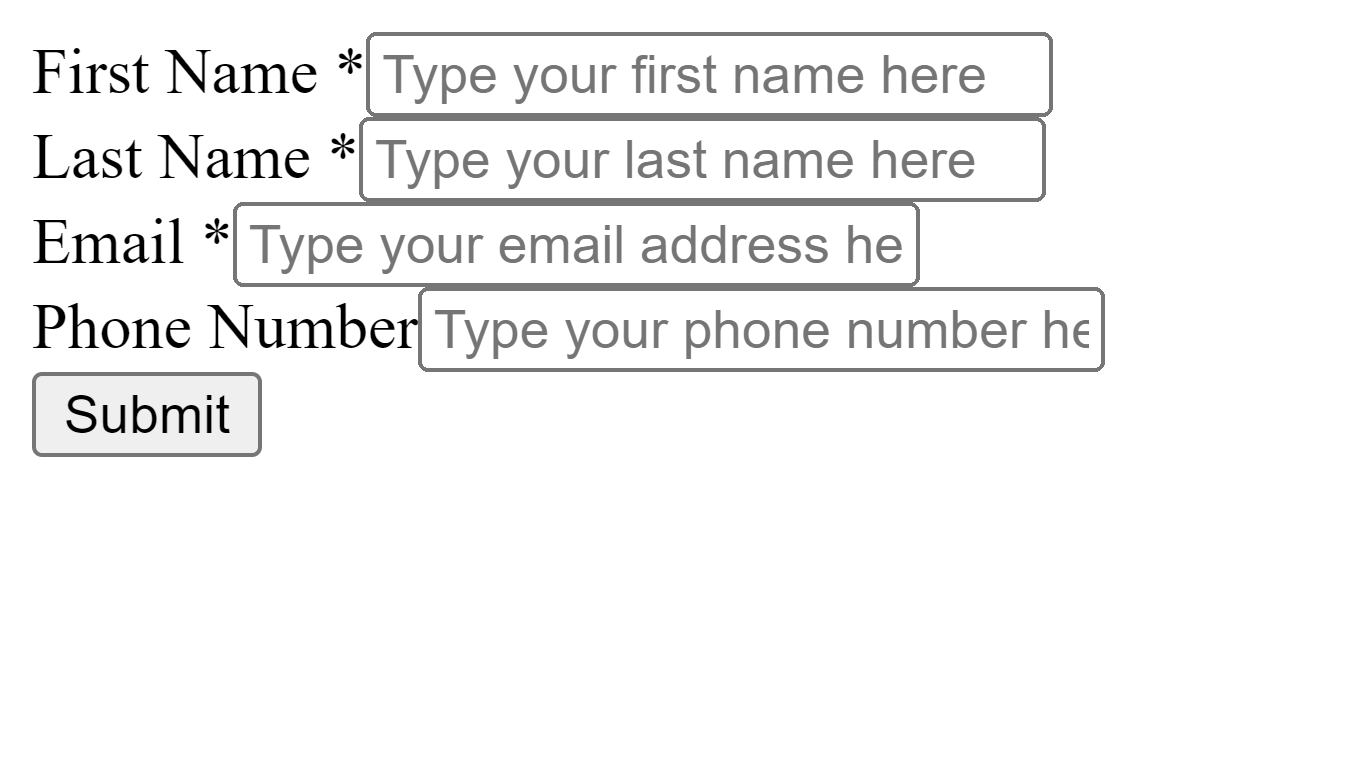
Dynamic form with Storyblok
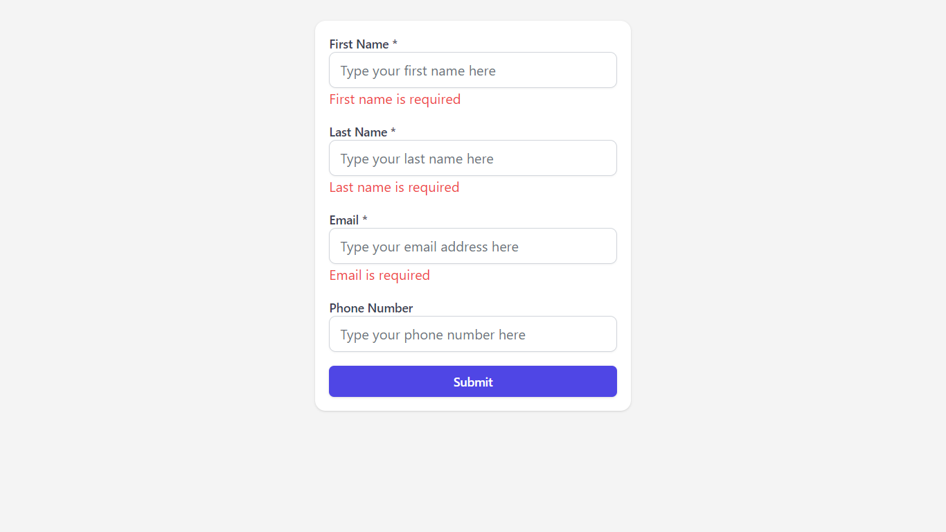
This is what it looks like when inputs are invalid:
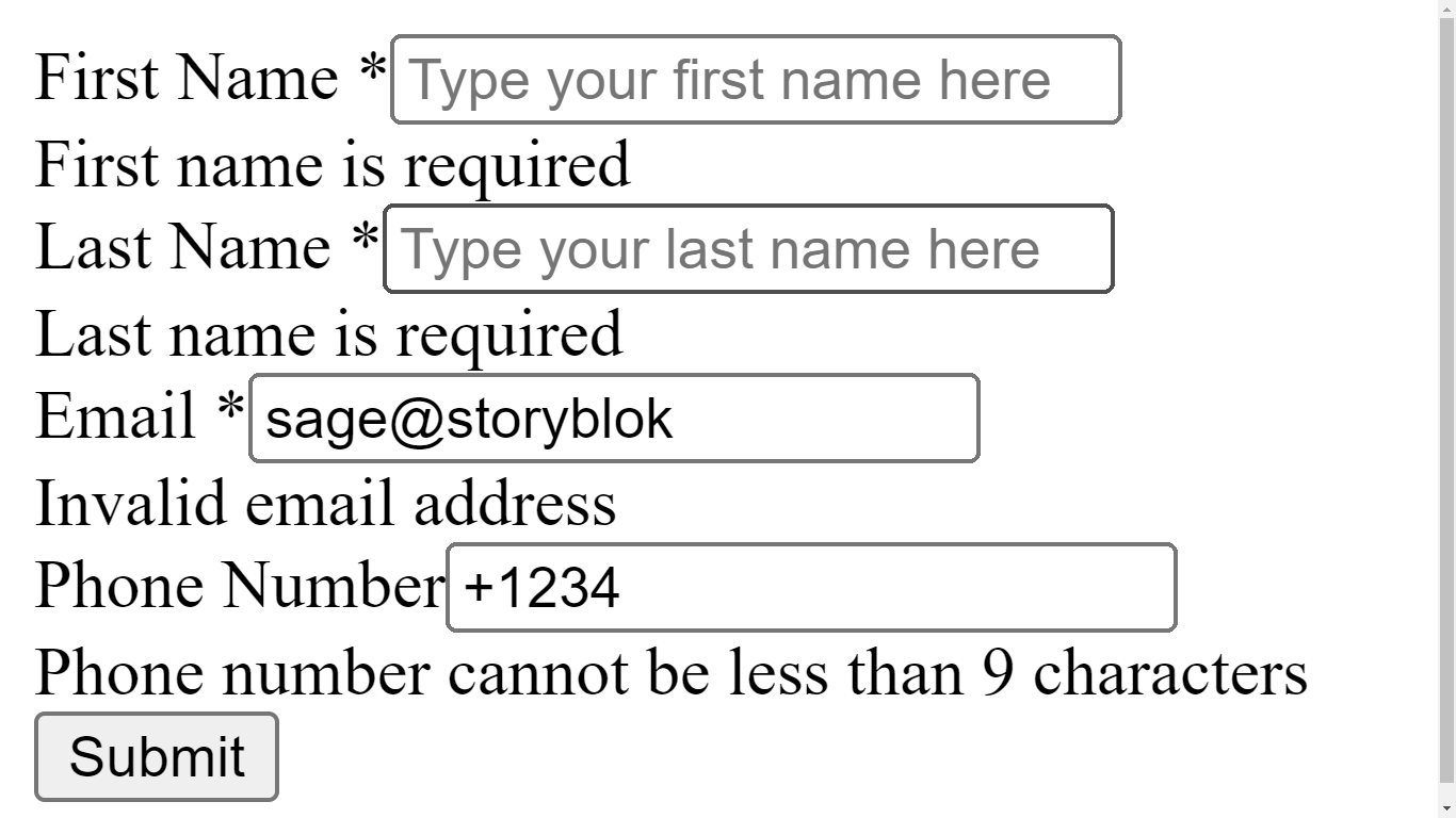
Form inputs
This is what it looks like when inputs are valid:
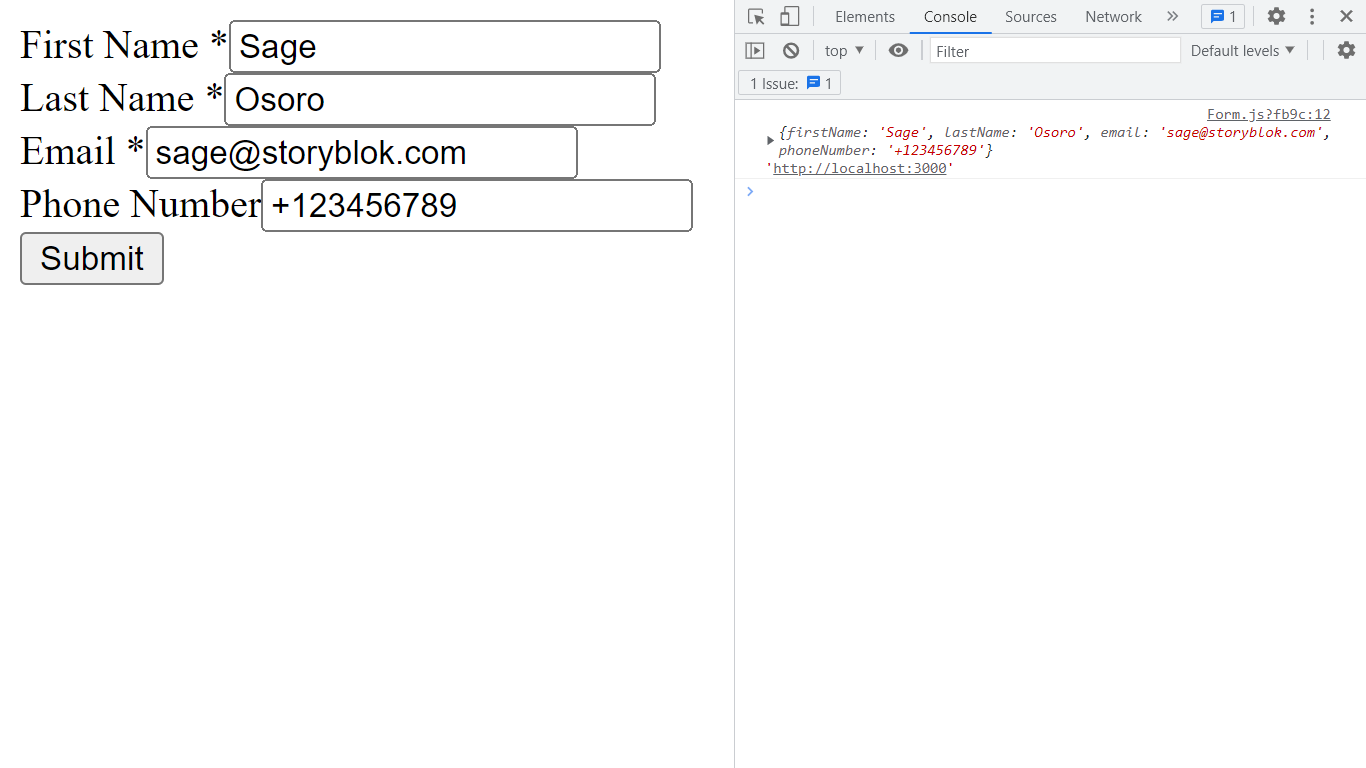
checking validity of form inputs
The next section will focus on styling the page/component.
Styling the form
In this section, I will teach you how to style your dynamic form with Tailwind CSS. Run the command below to create our CSS configuration files, tailwind.config.js file and postcss.config.js:
npx tailwindcss init -p
Configure the template paths in your tailwind.config.js file and add the forms plugin:
/** @type {import('tailwindcss').Config} */
module.exports = {
  content: ["./pages/**/*.{js, jsx}", "./components/**/*.{js, jsx}"],
  theme: {
    extend: {},
  },
  plugins: [require("@tailwindcss/forms")],
};
Begin styling by adding the three Tailwind directives and some CSS to globals.css, located in the styles folder:
@tailwind base;
@tailwind components;
@tailwind utilities;
@layer base {
  [type="text"],
  [type="email"],
  [type="tel"],
  select {
    @apply w-full border-gray-300 rounded-lg shadow-sm focus:border-indigo-500 focus:ring-indigo-500;
  }
}
html,
body {
  background-color: #f4f4f4;
}
Import globals.css into your _app.js file:
import "../styles/globals.css";Add the following CSS styling to the form tag of Form.js:
<form
`className="bg-white mx-auto my-6 rounded-xl w-1/3 p-4 shadow space-y-4"
  {...storyblokEditable(blok)}
  onSubmit={handleSubmit(submitForm)}
>
Also, add styling to the submit input tag:
<input
  className="w-full flex justify-center py-2 px-4 rounded-md shadow text-sm font-medium text-white bg-indigo-600 cursor-pointer hover:bg-indigo-700"
  type="submit"
/>
Open your FormInputs.js file and add the following styling to the label tag:
<label className="block text-sm font-medium text-gray-700">Finally, in the same file, wrap the Validators mapping in a div and add the following style to change the color of all error messages to red:
<div className="text-red-500">
  {blok.Validators.map((nestedBlok) => (
    <StoryblokComponent
      blok={nestedBlok}
      key={nestedBlok._uid}
      errors={errors}
      inputName={blok.Name}
    />
  ))}
</div>
Here is what the dynamic form looks like now:
Form validators
Conclusion
By following the steps outlined in this article, you can create and style a dynamic form that is both functional and aesthetically pleasing. The modular architecture and intuitive components provided by Storyblok make content management easy to update and maintain on multiple front-end frameworks, not just Next.js. In addition to creating forms, Storyblok is used for many other use cases, such as building landing pages, product listings, blog posts, and more. So don’t hesitate to experiment and explore all the Storyblok possibilities.
You can check out the complete code for this application on GitHub
Question or Feedback?
Author
