Create Custom Components in Storyblok and Remix
Storyblok is the first headless CMS that works for developers & marketers alike.
In this short tutorial, we will see how to start making our own components and extend the existing ones with Remix and Storyblok. We will add a new Hero component with two Layout options in Storyblok and the code in our frontend. We will also extend our Feature component by including images and better styling.
If you’re in a hurry, you can take a look at our demo in source code on GitHub! and take a look at the live version on Netlify.
Requirements
This is a part of the Ultimate Tutorial Guide for Remix. You can find the previous part of the series here (opens in a new window), which shows how to render Storyblok stories dynamically in Remix. We recommend you take a look at that tutorial before starting this one.
You can also look at the optional tutorial for the series Create Dynamic Menus in Storyblok and Remix.
Changing the Feature Component
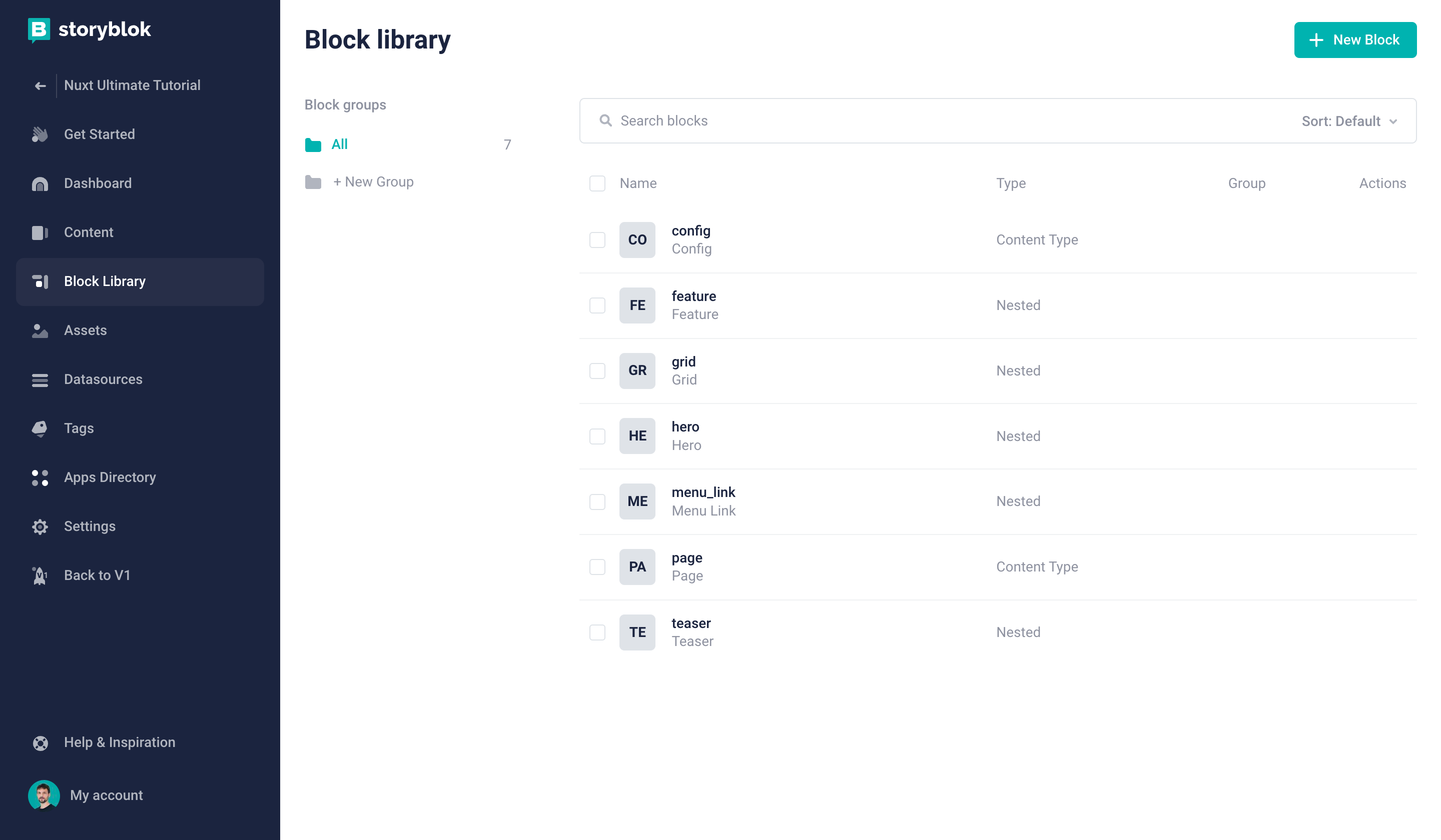
To view all the components, click on the Block Library tab {1} on the left-hand side as seen in the image.
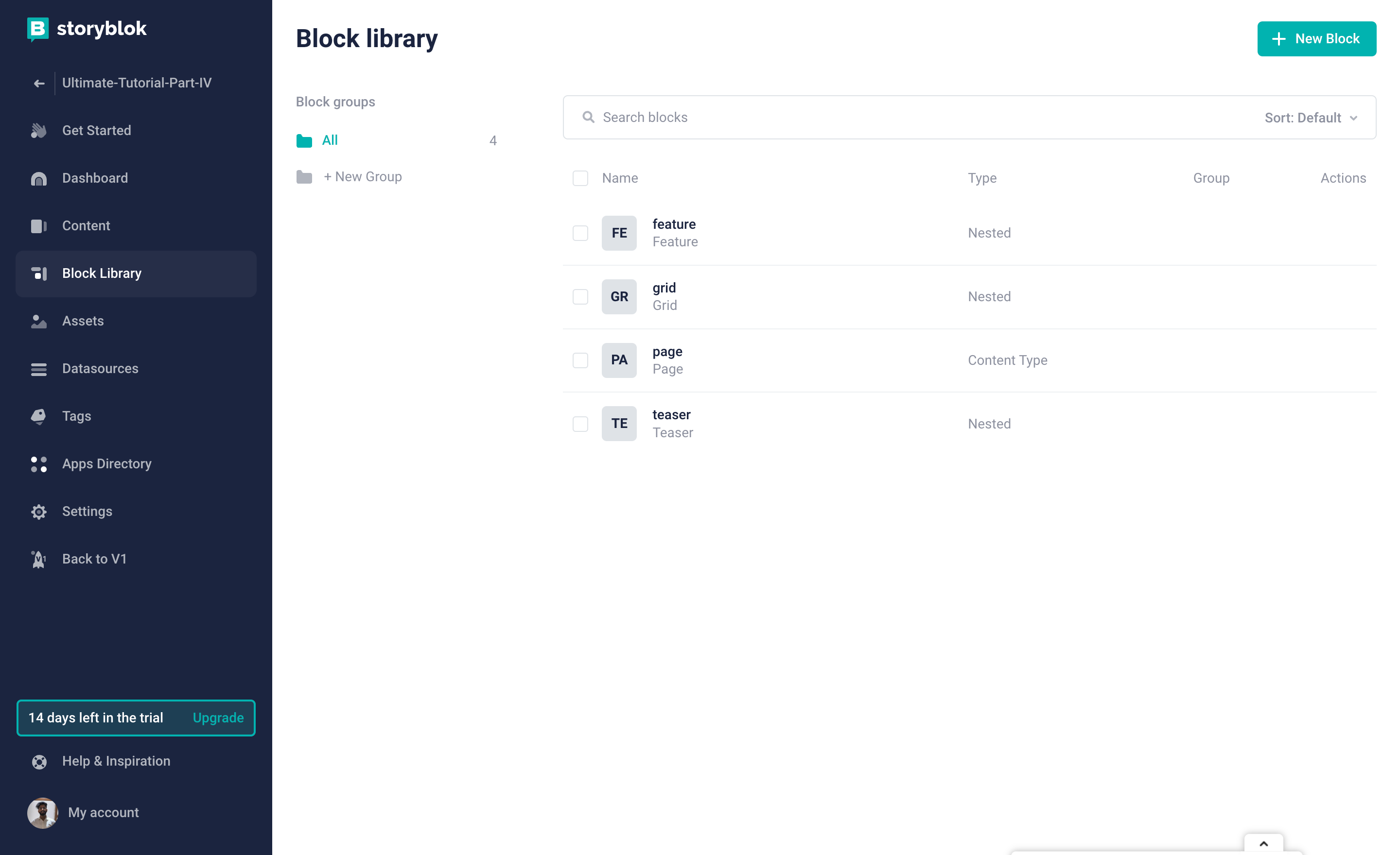
Block Library
Now, let’s edit the feature’s schema, and add image as a new field {1}.
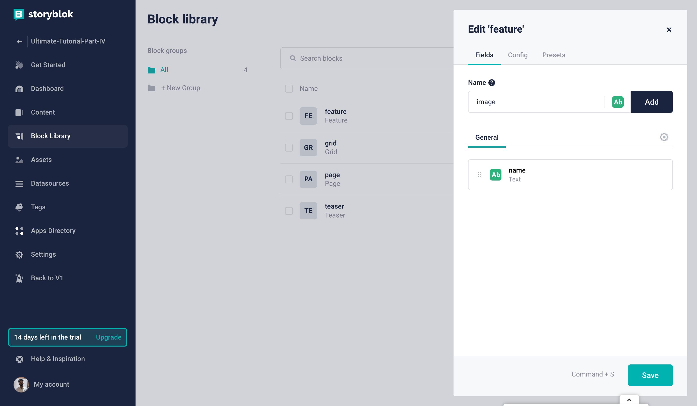
Add image Field
This image field should be of type asset. To change the field type and view other options related to the field, click on the field image.
Change the field type to Asset {1} and select Images in the Filetypes {2}.
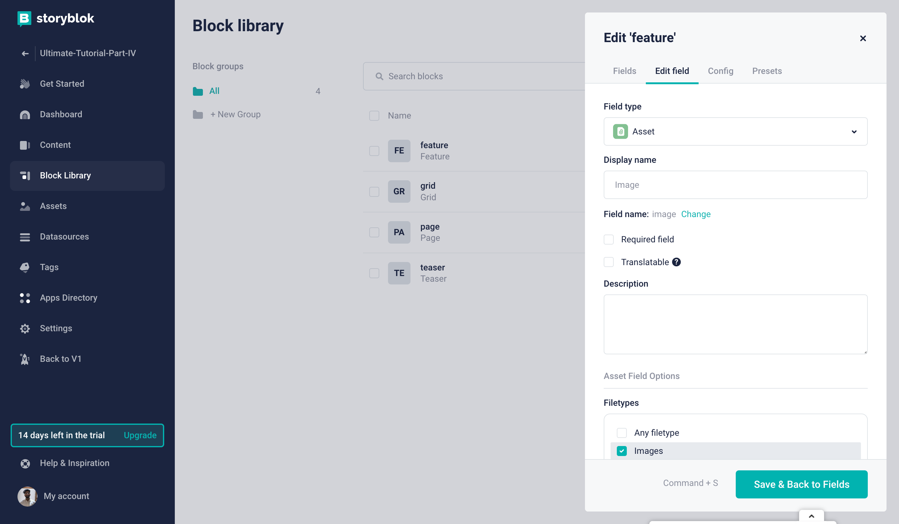
Change Field Type
We must change the code in our Remix app with the updated fields and styles.
Replace the code of Feature.jsx to the following:
import { storyblokEditable } from "@storyblok/react";

const Feature = ({ blok }) => {
  return (
    <div
      {...storyblokEditable(blok)}
      class="w-full bg-[#f7f6fd] rounded-[5px] text-center overflow-hidden"
    >
      <img
        src={blok.image.filename}
        alt={blok.image.alt}
        class="w-full h-48 xl:h-72 object-cover"
      />
      <div class="px-12 py-6">
        <h3 class="text-2xl text-[#1d243d] font-bold">{blok.name}</h3>
      </div>
    </div>
  );
};

export default Feature;
Let’s go ahead and add images to the features of a grid on the about page. To do that, we need to click on the Grid and then click on one of the features inside it. We will see that we have a field named image already present there. We can now add an image to a feature. Let’s add images for other features as well. It should look something like this:
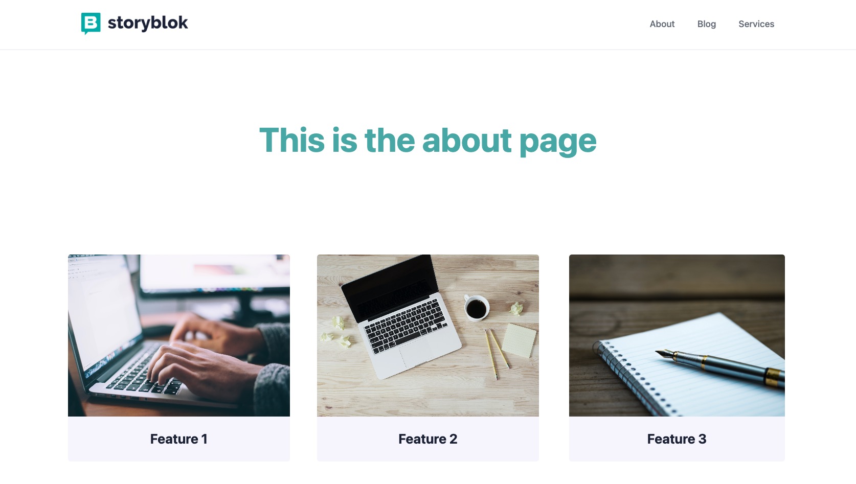
Features with Images
Creating a Hero Component
Before creating the schema for this new block, let’s first of all consider what we would like it to look like and what options we want to provide. I would say that a headline, a subheadline and a background_image field would be a great place to start. However, let’s kick it up a notch and provide the option to make this hero component use the full width of the screen.
First, go to the Block Library {1} and create a New Block {2}.
Creating a new block in the Block Library
It should be a Nested block {1} with the name hero {2}.
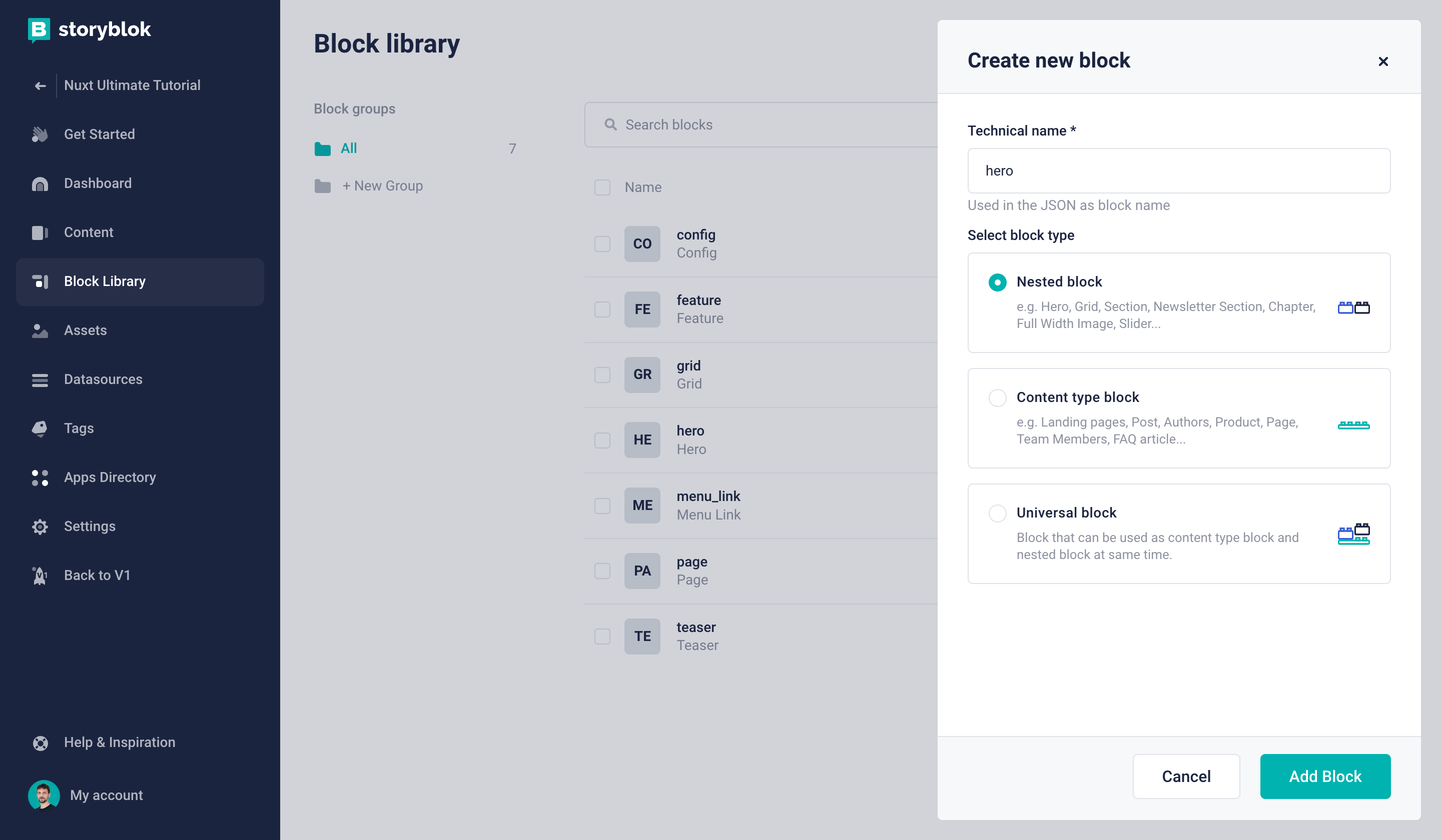
Creating a new nested block
Now we can create our first three fields:
headline: field type Textsubheadline: field type Textbackground_image: field type Image
The required steps for this are exactly the same as we have taken to add an image field to the Feature component earlier in this tutorial.
Once these fields are ready, we can create the layout field to make it possible to choose between two different layouts. Let’s add the field and choose Single-Option as its type {1}.
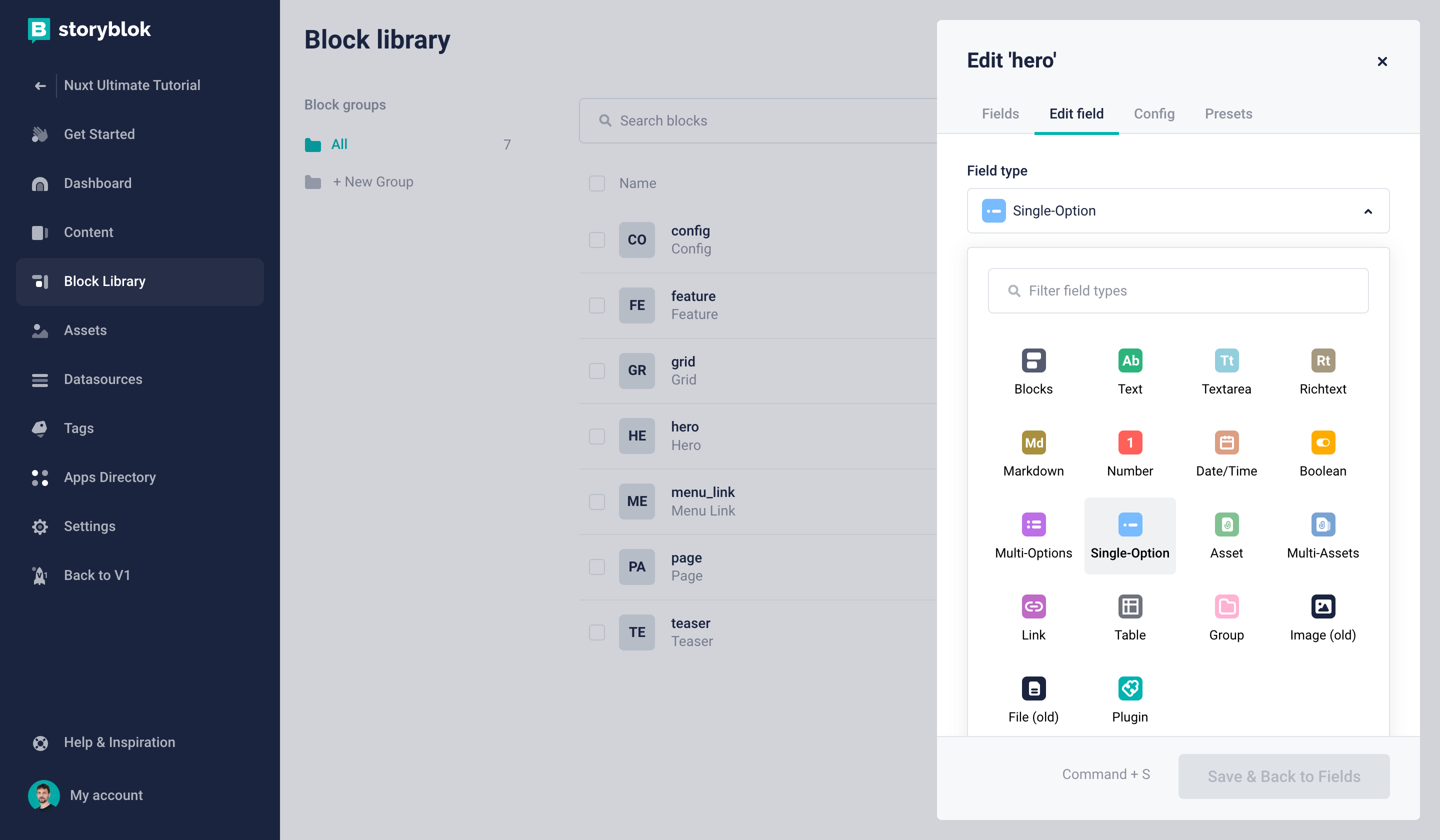
Creating a single-option field
Let's add two key-value pairs which represent the possible choices {1}, hide the empty option {2}, and set the default value to constrained {3}:
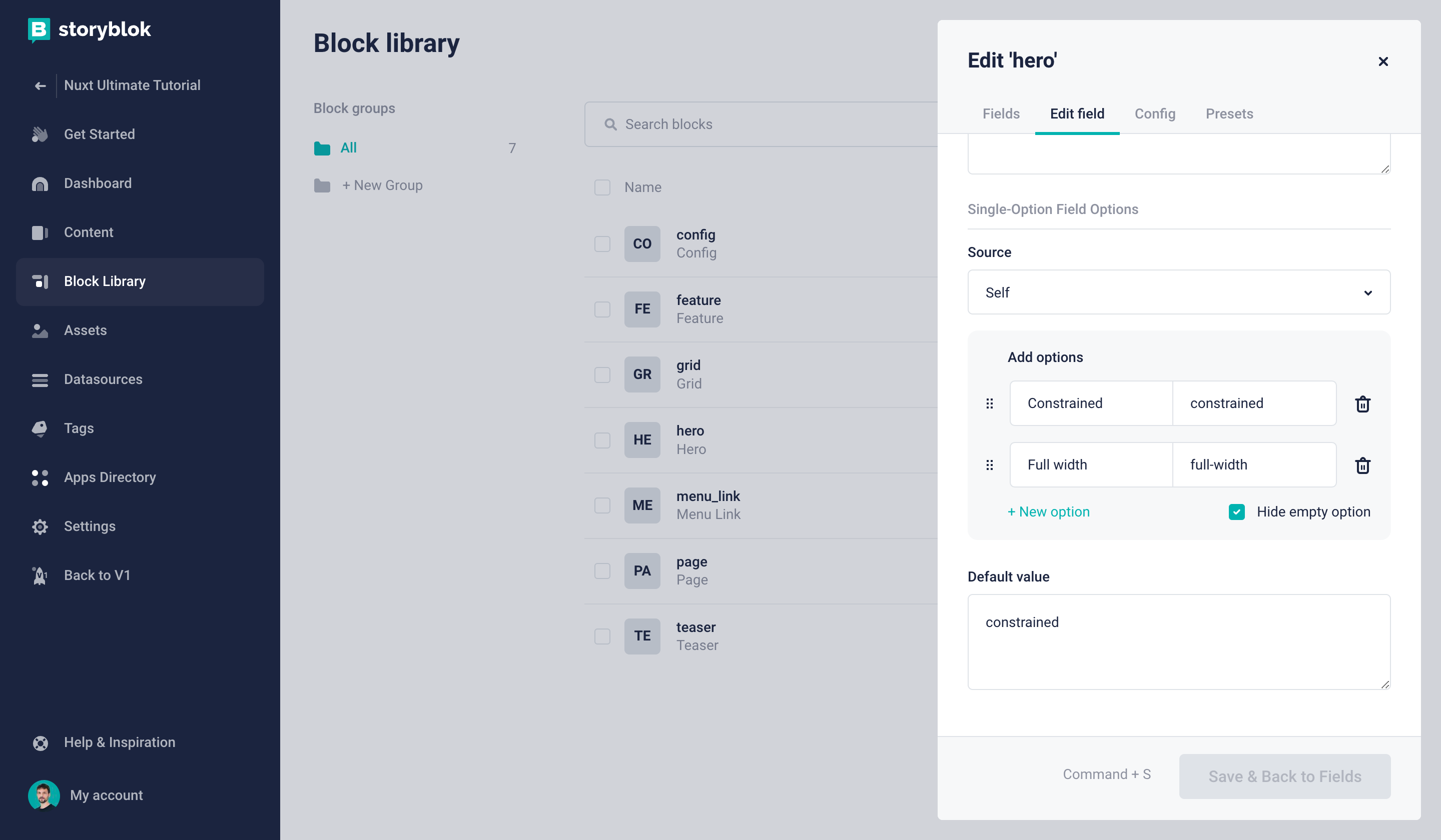
Defining the layout options for the hero component
Finally, save the component and add it to our Home story, right above the Teaser. You can already add some sample content to the fields. Of course, nothing will be shown in our frontend just yet. So let’s take care of that next, shall we?
Let’s hit save and add this component to our home story. Also, we should add content to the component’s fields. Feel free to use any text and image.
As we added a new component, we will also need to add the component to the frontend code of our project. Create a Hero.jsx file inside the components folder, and add the following code.
import { storyblokEditable } from "@storyblok/react";

const Hero = ({ blok }) => {
  return (
    <div
      {...storyblokEditable(blok)}
      className={`
        min-h-[500px]
        relative
        flex
        items-end
        justify-center
        p-9
        my-6
        rounded-[5px]
        overflow-hidden ${
        blok.layout === "constrained" ? "container mx-auto" : ""
      }`}
    >
      <div className="relative z-10 text-center">
        <h1 className="text-6xl text-white font-bold mb-3">{blok.headline}</h1>
        <h2 className="text-4xl text-white font-light">{blok.subheadline}</h2>
      </div>
      <img
        src={blok.background_image.filename}
        alt={blok.background_image.alt}
        className="absolute top-0 left-0 z-0 w-full h-full object-cover"
      />
    </div>
  );
};

export default Hero;
Note that we are changing the styles of the Hero section depending on the selected layout. This is being done conditionally on line 17.
The only thing left to do is add this to our list of dynamic components in root.jsx.
...

import Hero from "./components/Hero";

const components = {
  feature: Feature,
  grid: Grid,
  teaser: Teaser,
  page: Page,
  hero: Hero,
};
...
Save and go back to our Home story in Storyblok. We will see something like this.
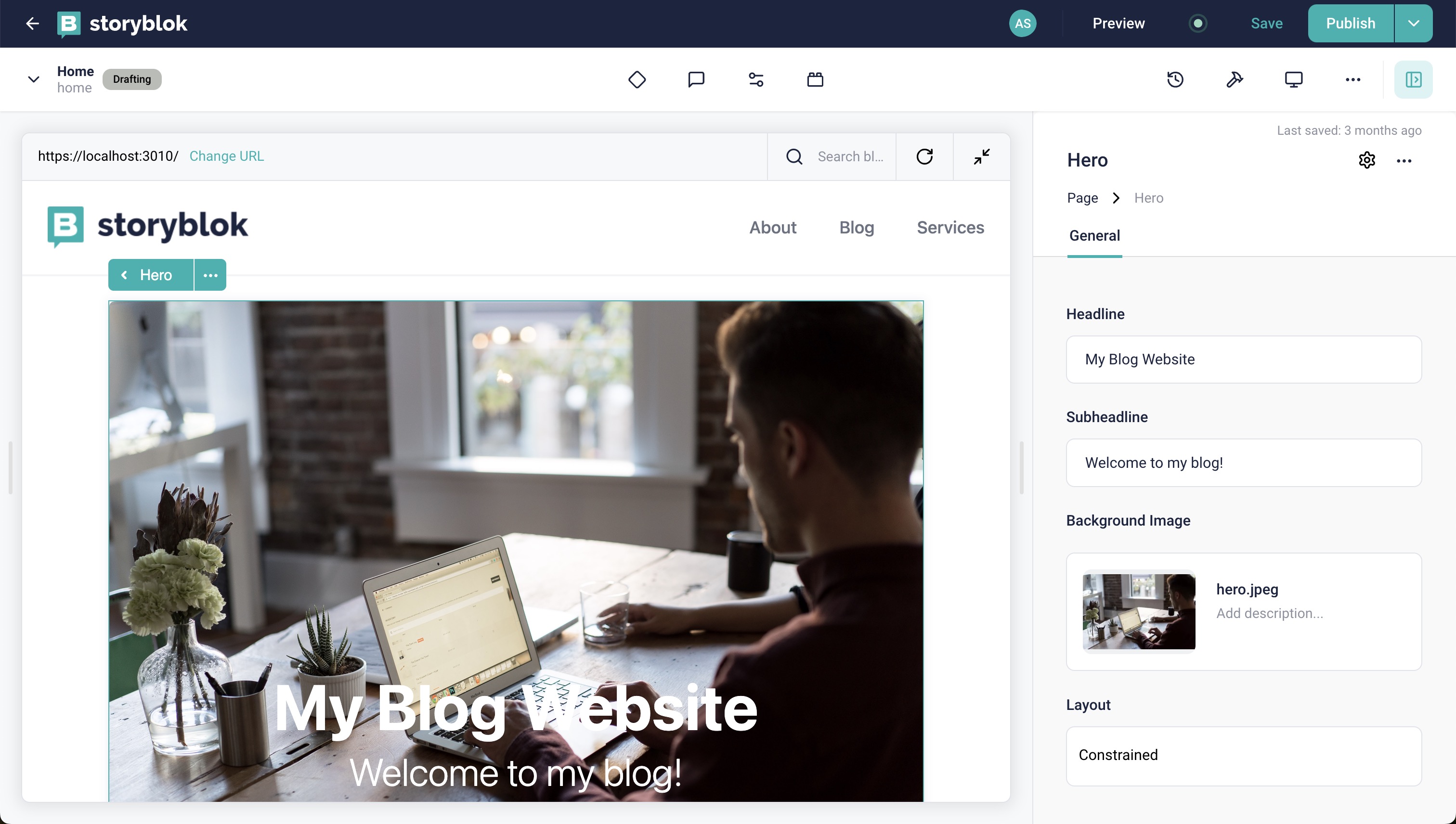
Hero with constrained layout
We also have an option to change the layout here. We can choose the other one from the dropdown and we will see the changes.
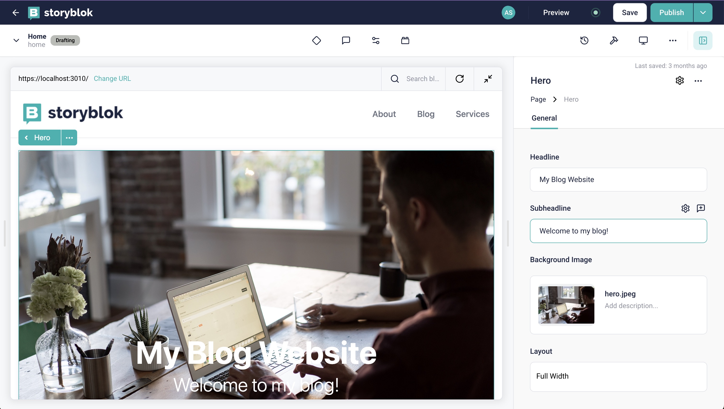
Hero with full width
Wrapping Up
In this tutorial, we saw how to extend and create new components from scratch with different types of fields, along with the integration of those components into the frontend of our application. Congratulations!
In the next part of this series, we will see how to create and render blog articles in Storyblok and Remix. You can find it here.
| Resource | Link |
|---|---|
| Storyblok Remix Ultimate Tutorial | https://www.storyblok.com/tp/the-storyblok-remix-ultimate-tutorial |
| Github repository | https://github.com/storyblok/remix-ultimate-tutorial |
| Storyblok Technologies Hub | https://www.storyblok.com/technologies |
| Remix Technology Hub | https://www.storyblok.com/tc/remix |
| Storyblok React SDK | storyblok/storyblok-react |
Question or Feedback?
Author
